Colin Gordon Interview
1st Aug 2018
Colin Gordon is a familiar face at Korero Press. His work has featured in the long out of print book Burlesque Poster Design: The Art of Tease. More recently he's helped with some cover design and has provided some illustrations for a side project called Wolfbait. He works in the games industry as a character designer and animator, but also works freelance, creating posters, logo design, illustration, and album covers. If you can catch his art show, Ink & Paint, at the Wonderbar in Leytonstone, London on the 6 September to the 5 October.
Tell us a bit about your art/design background, and the early days of your career.
I did animation at university, then worked in computer games companies for a bit before giving it all up to play guitar in a band. I got into doing the sleeve art, then eventually learned how to screen print and started printing posters in my bedroom, and got really hooked on using limited colours and simplifying the artwork, using bold colours and strong images.
Who and what are your greatest influences?
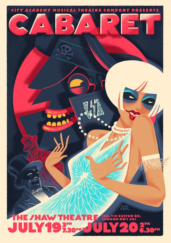
Growing up it was comics-2000AD especially. Mike McMahon, Ian Gibson, Cam Kennedy and Brett Ewins, then later Jamie Hewlett. Poster design has always influenced me, from Hollywood B-movies posters to screen-printed gig posters, but especially early twentieth-century European posters by such artists as Begarstaffs, Ludwig Hohlwein, Adolfo Hohenstein and René Gruau. Bold, simplified and stylish designs.
Your art is very popular on the resurgent Burlesque scene – how did you first get involved with Burlesque?
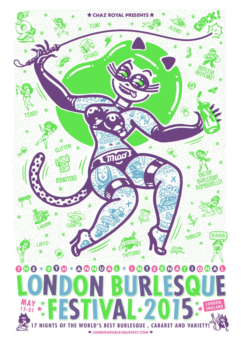
Originally through a site called gigposters.com, where I met Chaz Royal, who was looking for artists to do posters for a Fluffgirls Burlesque UK tour. I did a poster for him then, and then when he began the London Burlesque Festival, I did the poster and logo. Then it just became a regular thing, and I did his website for a few years as well, and then the artwork for the World Burlesque Games, the Australia Burlesque Festival, the Amsterdam Burlesque Festival and other shows. Designing logos, posters, websites and so on.
Is there a project that you’re particularly proud of?
I made a little book called Bubblegum T.N.T. which was a lot of fun. It was inspired by the London Burlesque 2016 poster artwork, which had a lot of little tattoos all over it. I was thinking about old transfer tattoos from bubblegum packs, and making these super simplified designs for the background of the poster. They were a lot of fun to do, and I had lots of them which I didn't know what to do with. I’d just been learning bookbinding at the time, so I compiled them into a book and hand-bound them, screen printing the cover. It was a real DIY effort but a really enjoyable process.
Can you give us a brief description of your work process?
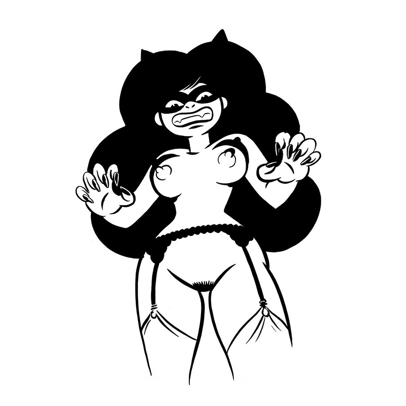
The first stage is usually roughing out and sketching lots of ideas trying to find something that resonates. Generally with a pencil in sketchbook. For the burlesque posters, there is usually a lot of looking through my reference folders of old Hollywood glamour shots and burlesque pin-ups for costumes or looks or poses that look good. Then I’ll start blocking out shapes in Photoshop. Usually just in black or shades of grey. I have a couple of very simple brushes I use. I think about the shapes and how they fit together, and I try to simplify them. Then I add colour, which is often the trickiest part for me. But when it all comes together and the colours start to pop and glow, it is very satisfying.
You’ve been involved in a lot of fun and interesting projects during your long career. Is there anyone you’re interested in working with, or for, that you haven’t yet?
I’d like to design more toy figures. I do some sculpting and casting of my own characters, but it would be nice to design some cute characters and get them produced and in the shops.
Any future projects/exhibitions/books that we should be watching out for?
I have a series of paintings in the works, more prints, and a couple of new book ideas on the go which should be ready for new year.
