Falling in Love
14th Feb 2019
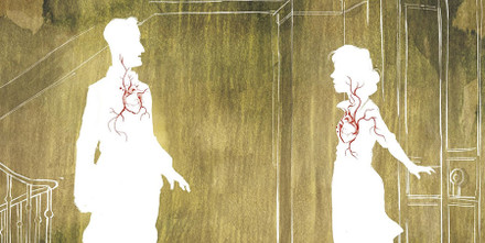
Horizontal Collaboration is Korero Press’s first venture into the world of graphic novels. In this interview we talk to Carole Maurel about the making of a double page spread in the book. In this instance pages 20-21 in which the characters Rose and Mark fall in love at first sight.
Creating this graphic novel was a big challenge for the artist, Carole Maurel:
"I had to break away from everything I had done so far. On the one hand, I needed to use the things I had learned and more or less mastered on previous books but also get some distance from them from time to time.
When I got the synopsis from the writer, Navie, I already knew, because it was a clear desire of hers, that at certain times, for certain scenes, I would have to move away from a literal illustrative approach and get closer to a less realistic and more symbolic form of representation, even to the point of abstraction, in order to be able to represent the feelings of the characters graphically.
This was the case in particular for the pages about Camille, the blind character in the story, whose blindness I had to depict symbolically. It's not easy to show the feelings of a blind character without being able to rely on sound, something that can be done in the cinema but not in comics: you have to transcribe sounds visually by means of onomatopoeia, or by different graphic processes — a colour or a shape can evoke a sound, a smell, feelings of warmth, cold, touch — all depends on the associations you create.
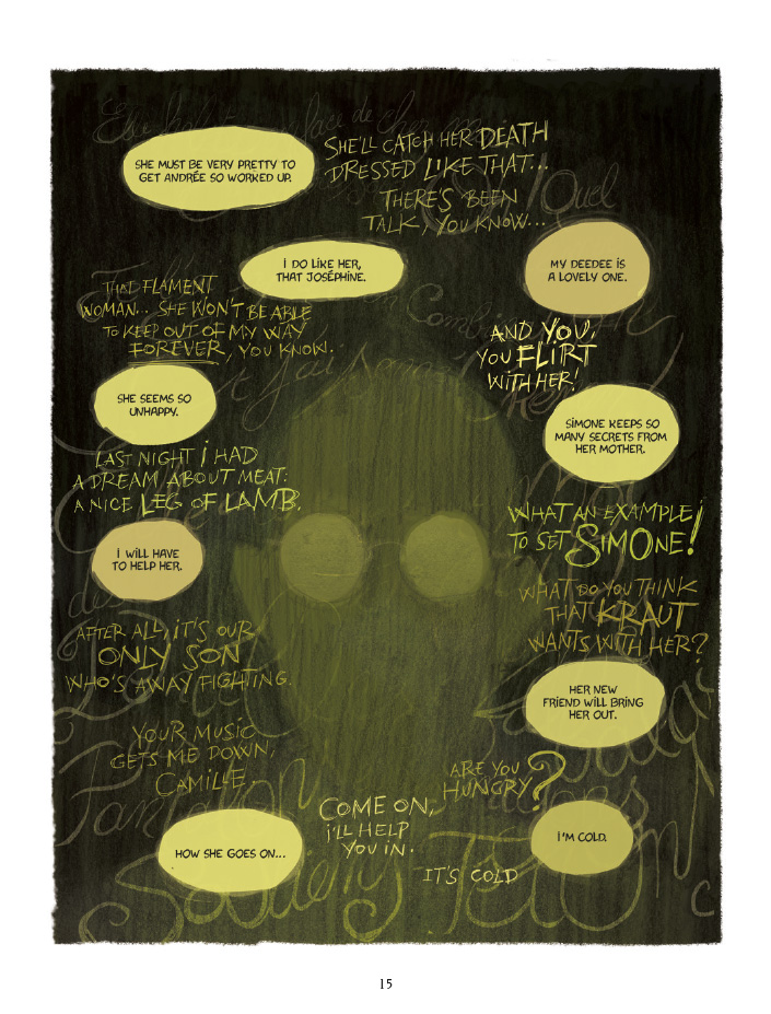
The exercise of switching to an unconventional mode of representation is difficult because you are trying to engage the reader emotionally, and not everyone feels things the same way.
The difficulty is in trying to affect everyone emotionally without bypassing the writer's intentions and still aiming at intimacy. And that's very hard. Some emotions are quite easy to illustrate: happiness, depression, anxiety, anger, fear, joy. Maybe because they're emotions that we're used to seeing pictured... but love at first sight...?
Navie sent me her first outline without dialogue, a step-by-step overview of each scene. I could tell it wasn't going to be easy.
I decided that this double page would be one of the first I would colour. I also knew that I would come back to it later. One always goes back to the first pages to be coloured, to ensure a consistent rendering in the entire book.
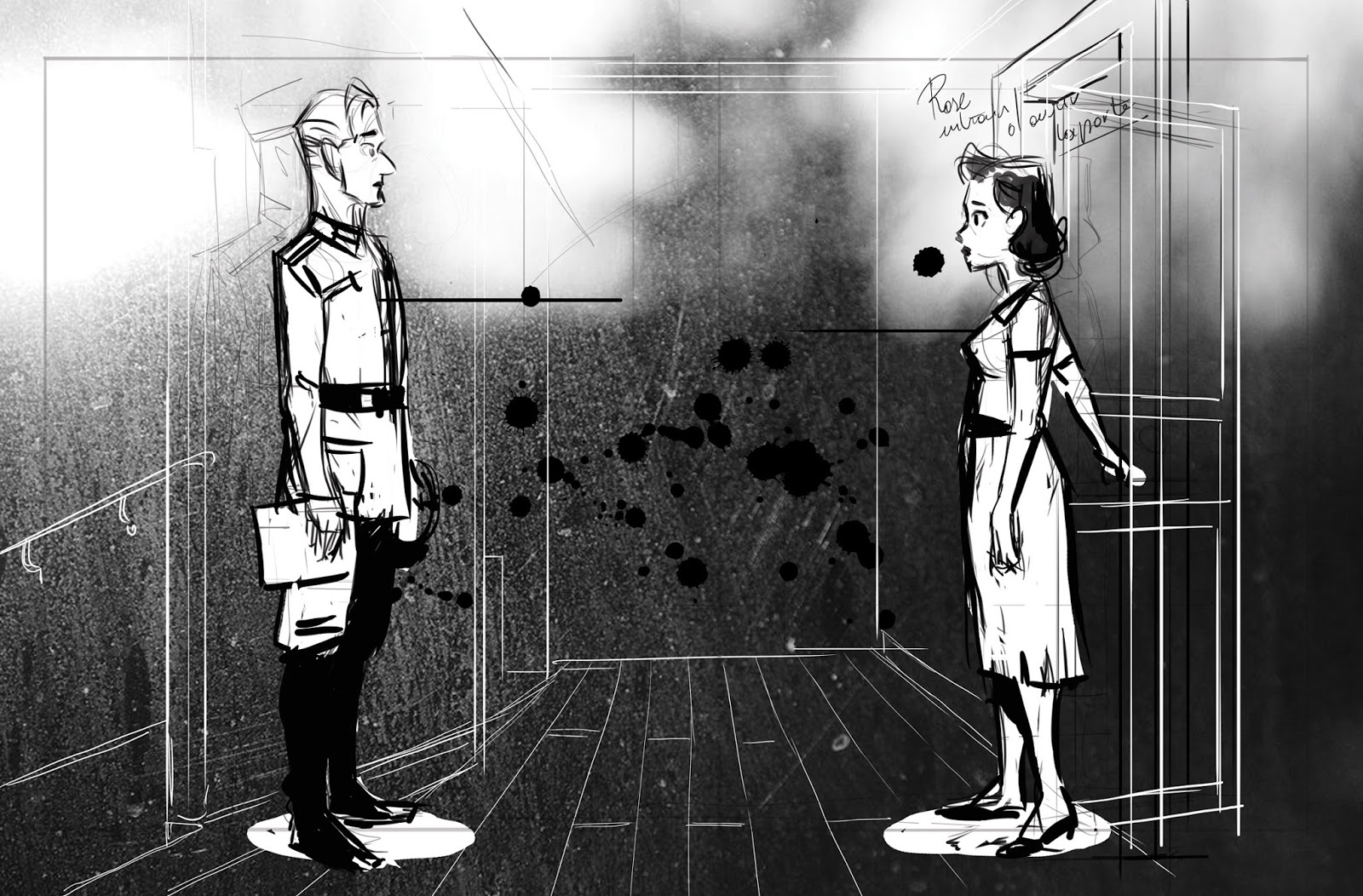
So I did a first sketch, at least for the storyboarded version. Then I did a quite quick colour draft. It wasn't convincing, either for Navie or for me. It did the job, but nothing transcendent for my writer or me.
What does it mean love at first sight? It’s hard to visualise. We needed a bit of a brainstorm.
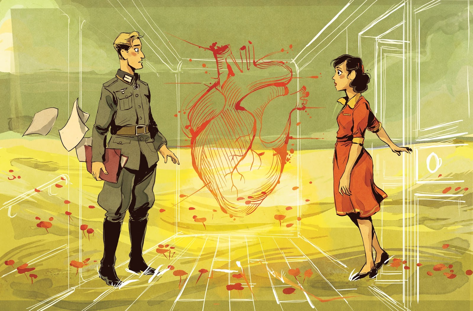
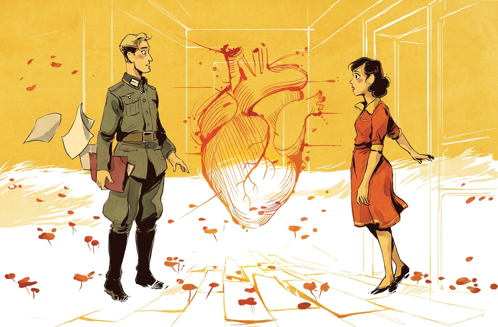
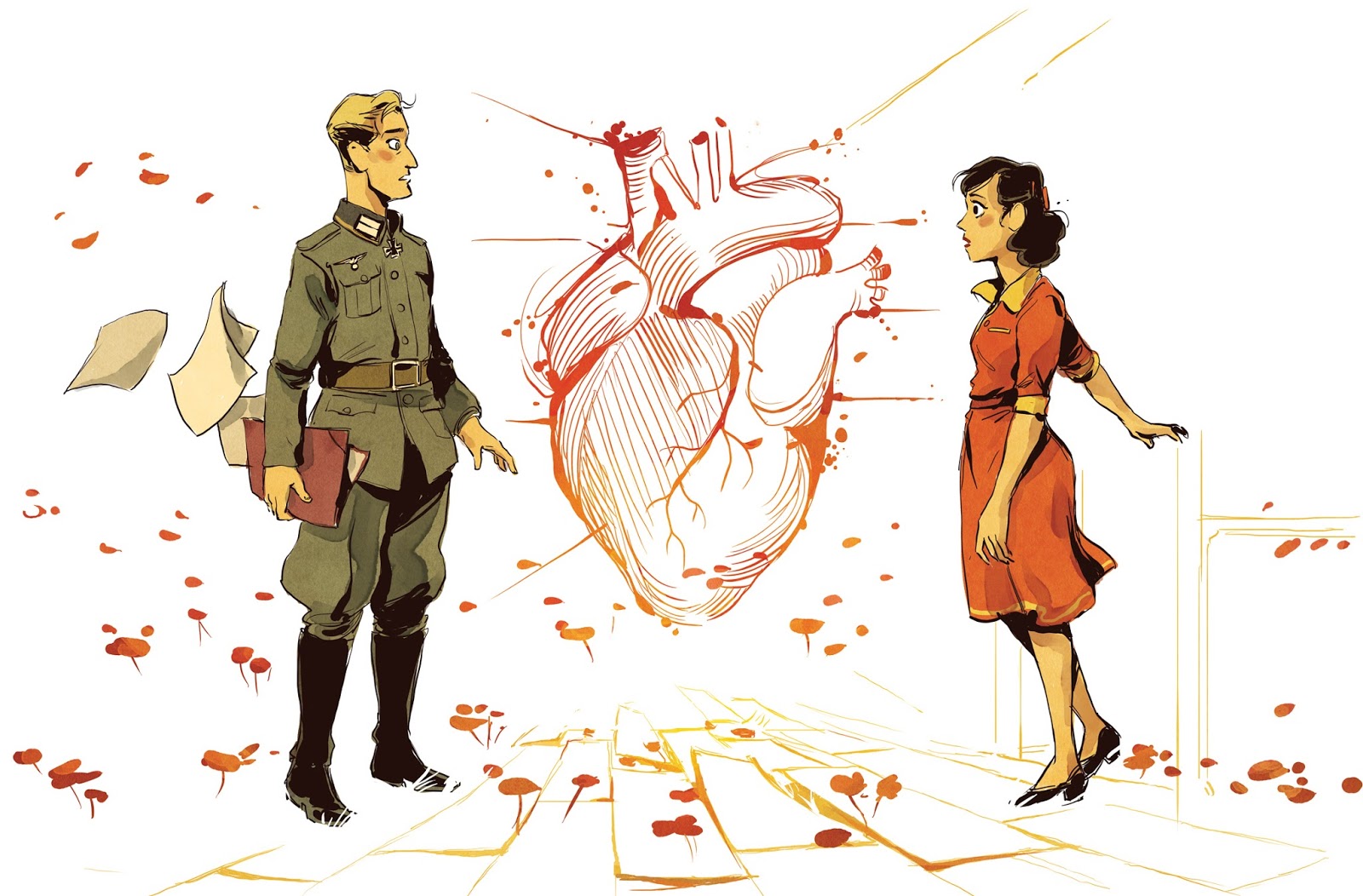
Ask your friends, and you will get very varied and different answers depending on their personal experiences. For me it's a brief moment, suspended in time, where we focus on the other person, and everything else no longer matters — the scenery, the people, around us disappear; we don't hear them any more, we don't see them any more. We'll focus on a look, a gesture... There is such a distortion of perception of the context and the person you have in front of you, that you are often surprised on the second date.
Maybe I feel that way, but it wouldn't necessarily be the same for Navie or the readers. I'm not in their heads! I apply a fairly simple rule when I find myself confronted with this kind of problem: the farther you get from realism, the more you play with it, the more you manage to engage the reader's imagination. We have to make sure that the readers themselves become active; that means "to suggest, not show everything" so that readers can take ownership of the story, project themselves more easily into the situation.
I decided to put this problematic double page spread aside for a while and move on with the rest of the story. Working on some other pages gave me a few leads. There is a graphical element that frequently reappears: the heart. I included it in the double page but maybe not in the right way, perhaps not in the right place.
Towards the end of the book I was working on this full page (sorry for the spoiler): I found how it worked graphically interesting. There's no background as we focus on Rose's feelings. Rose who, at this point in the story, has collapsed. All that remains is her white silhouette marked with scratches. I felt it was a really successful representation of what was going on.
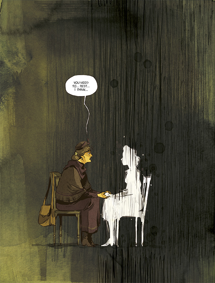
What if I tried a similar technique on the double page spread? It would be risky, for on the page above, I had to show a devastated, destroyed character and on my double page, the feeling I had to illustrate was the very opposite of that.
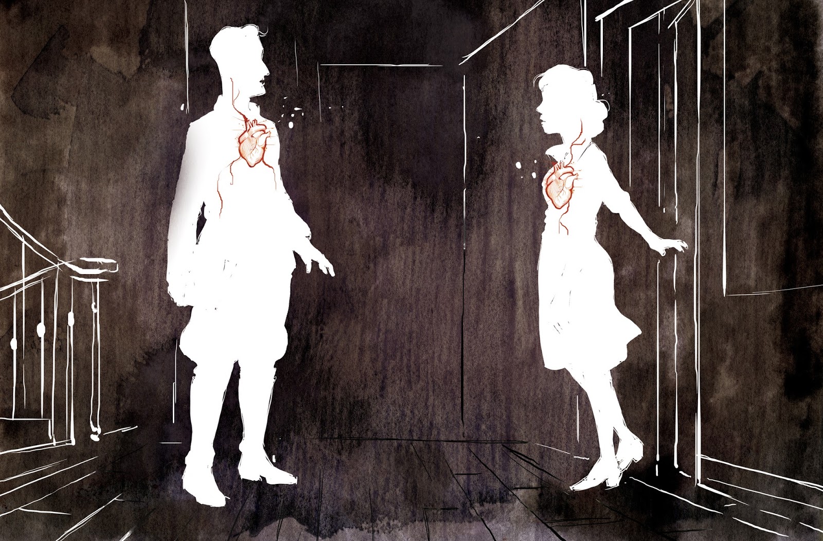
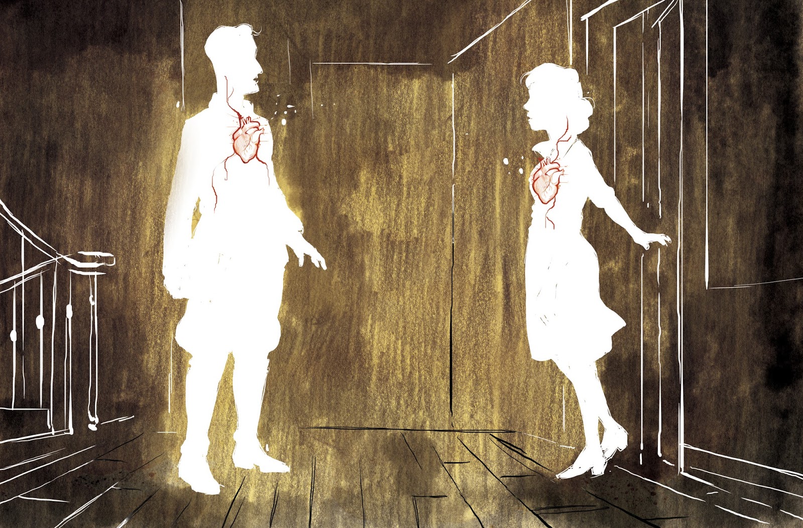
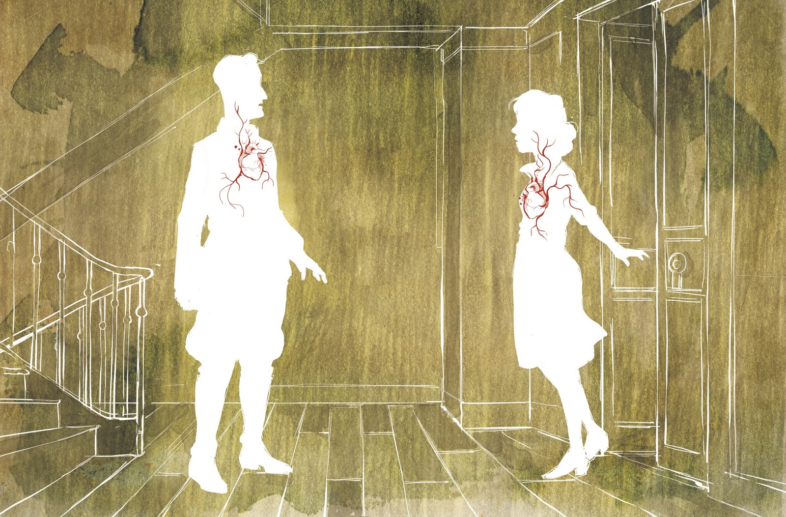
I still did several drafts and was excited to show Navie. We both agreed it worked: two hearts beating in disembodied silhouettes with the background suggested by the lines of perspective. After some minor tweaks, it also worked for the editor, and we signed it off."
