Horizontal Collaboration Cover Design
17th Sep 2018
Horizontal Collaboration is Korero Press’s first venture into the world of graphic novels. In this post we talk to Carole Maurel about designing cover, for when working on a book, one of the most delicate and exciting things is designing the cover.
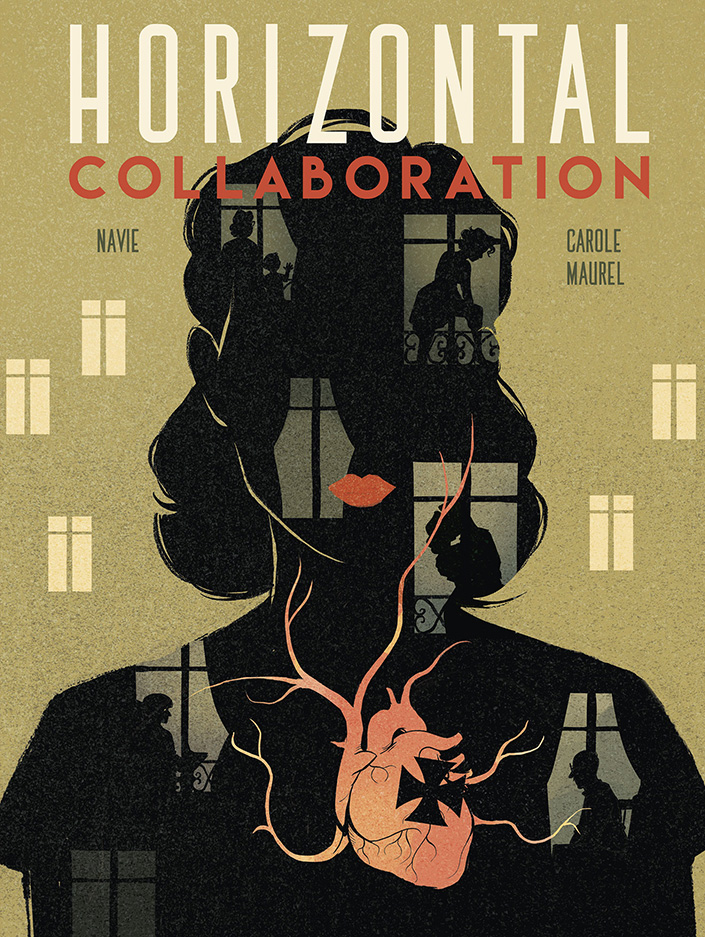
We've had lots of great feedback about the cover for Horizontal Collaboration, so we thought it might be interesting to show you just some of the steps that led to the final result… and there were plenty of them!
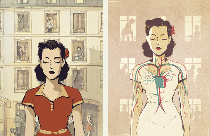
From the start, Carole Maurel wanted to design a cover that was graphically distinct from the content and reminiscent of posters of the period. So the first step was a bit of visual research. Propaganda and cinema posters went into the mix as Carole soaked up the graphic conventions, colours, textures and processes of the day.
She says: ”We discussed several ideas, with varying levels of success. With hindsight, I realise that some were not so bad. We didn’t rule anything out. You never know, sometimes two separate ideas can make a very good one when they didn't work in isolation.
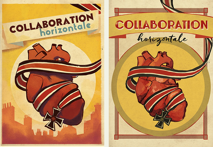
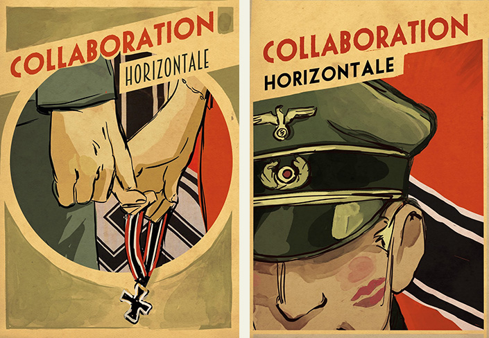
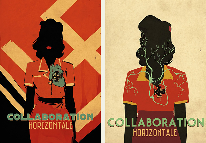
Once we put aside the rather obvious ideas based on swastikas and lipstick on cheeks, we kept those that ‘stood out’ a little. We kept ideas based on a stylised building front, a silhouette and a human heart and we condensed it all.”
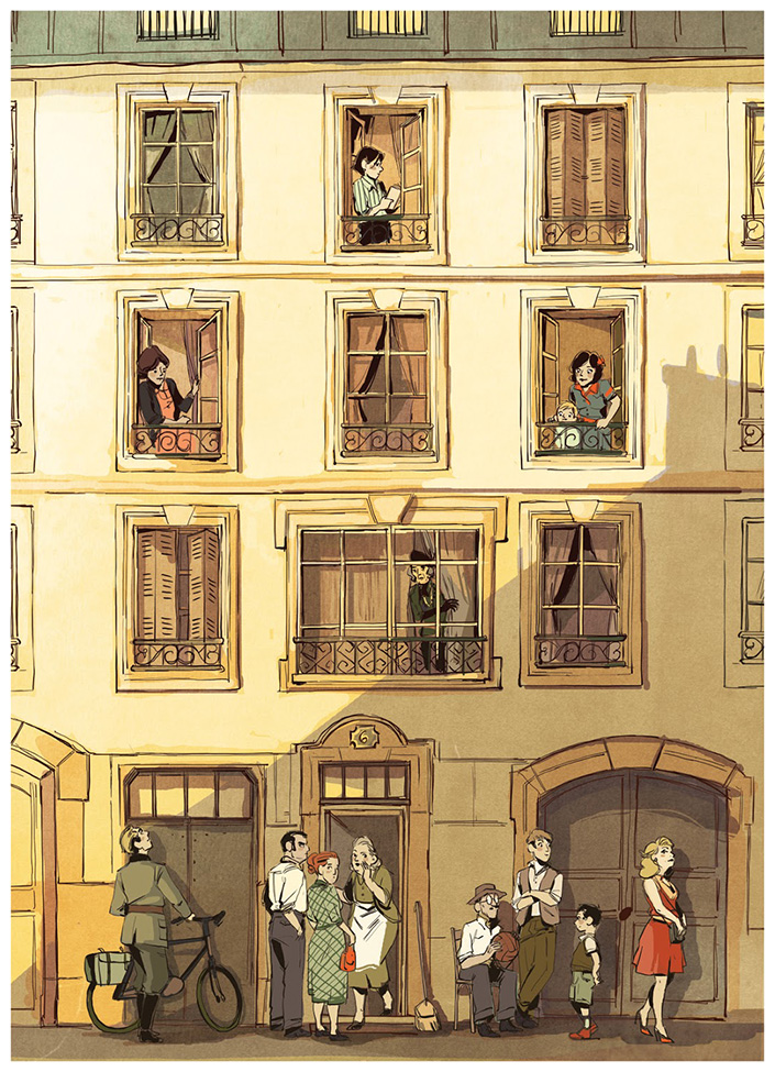
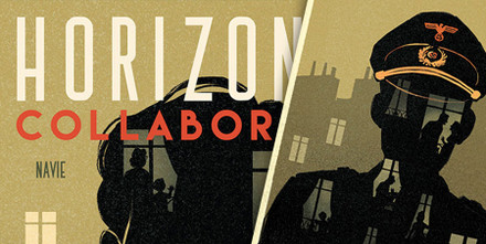
Carole continues: ”The heart is one of the recurring themes in the story, and we wanted to use it on the cover while somehow keeping the facade of the building in the background. We wondered for a long time if it might not be too much information to take in on a single visual. I tried again, and again, and I took the opportunity to start sketching something for the back cover.
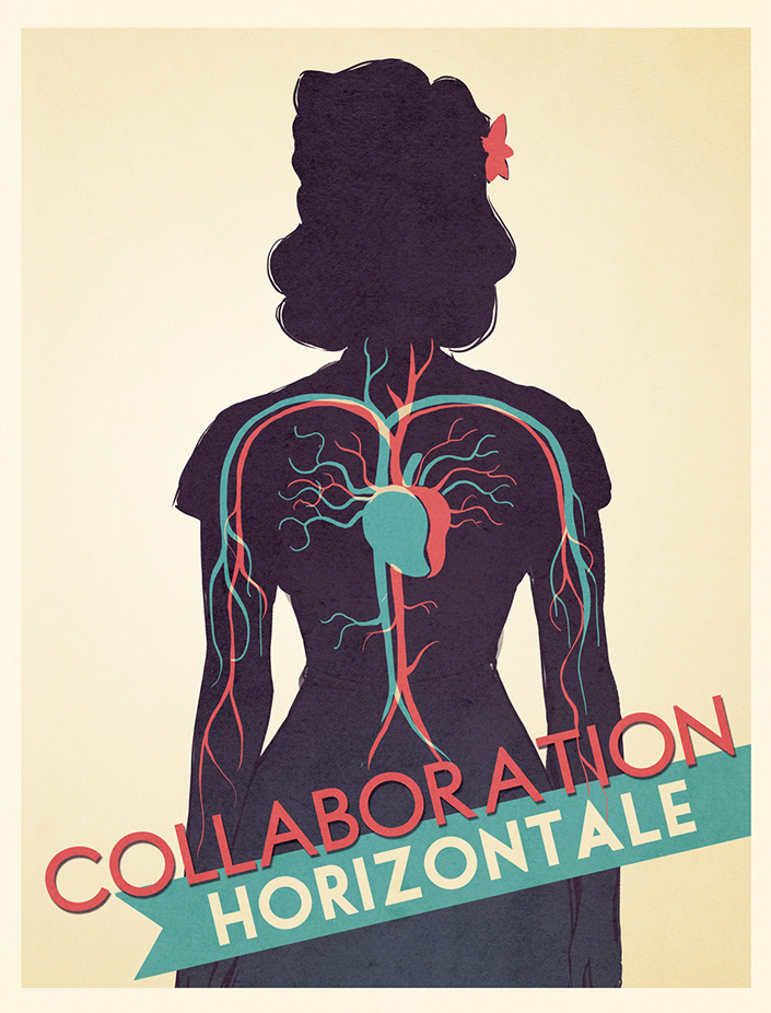
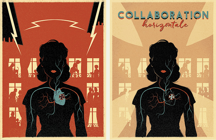
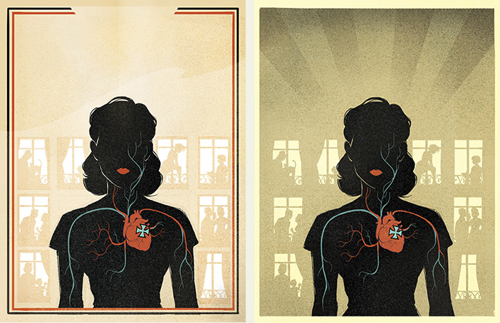
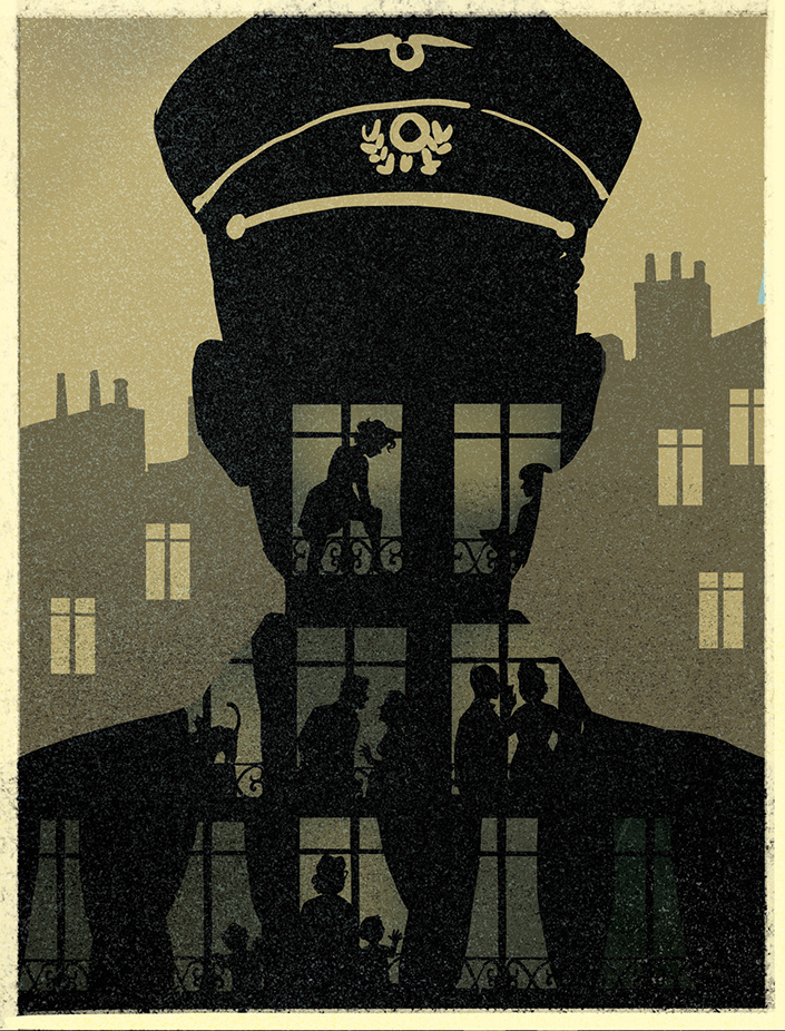
For that, we thought that something was starting to come together: the silhouettes behind the windows came out better when they were positioned over Mark's silhouette. We decided to use that technique for the cover and Rose's silhouette, while giving a less rigid look to the alignment of the windows by changing their size and position. From then on, we began a stage of final adjustments before everything went to the graphic designer to position the title type.
And after the final iterations – heart or no heart, its colour, size of the branching arteries, overall simplification of the visual – we got to the final result you now know.
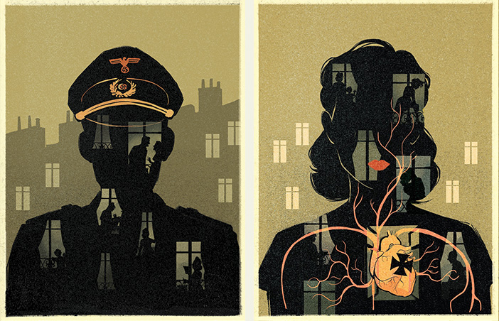
And as I said: you have to keep the first ideas in mind because you never know. For we did, in fact, use an earlier design for the title page after ruling it out for the cover."
And now you know everything (or almost)! Happy reading!
