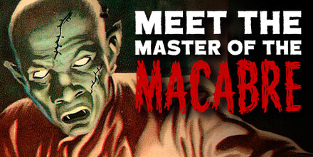
Meet the Master of the Macabre: an Introduction to Jayme Cortez in Five Freaky Pieces
Posted by Emily Roach on 9th Jul 2024
In the world of Brazilian horror comics, Jayme Cortez stands out as one of the most innovative and influential artists, and it’s time to give him his flowers. With his exceptional draughtsmanship and an intuitive eye for composition, the Portuguese-born Cortez mastered various mediums and styles. Whether he was inking iconic horror villains on the covers of O Terror Negro or rendering Poe’s works in psychedelic technicolour, Cortez’s ambition and creativity were always evident. Chosen from both volumes (Terror and Macabras), these five illustrations will transport you to a world of menacing spectres, damsels in distress, and creatures of the night.
O Terror Negro no. 15, 1952
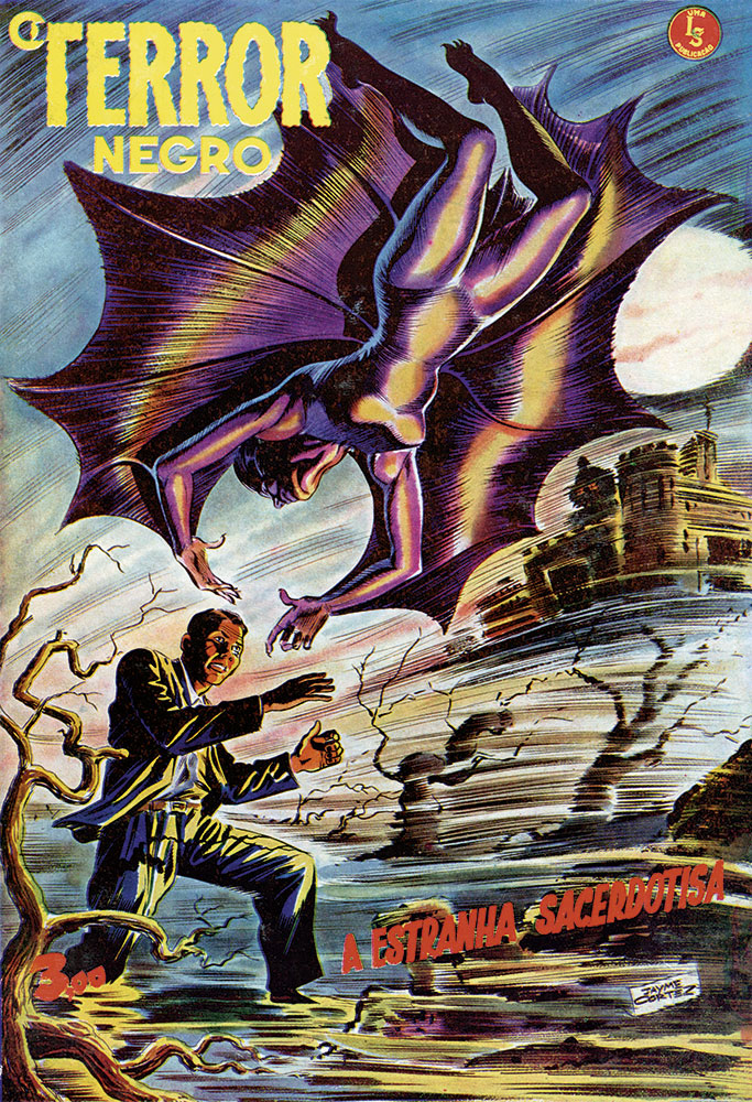
As the exclusive cover artist for O Terror Negro from from 1951 to 1956, then sporadically until its closure in 1967, Cortez proved his place in the pantheon of great twentieth-century comic artists. With its dynamic action lines reminiscent of a Jack Kirby panel, this early cover in his tenure shows an illustrator in tune with the artistic context of his day. The warm primary colours of his American contemporaries have been warped and muddied, inverted into an uncomfortable palette of clashing yellow highlights and murky blue skies. Most striking of all, however, is the mysterious catsuit-clad assailant. Dressed like an Irma Vep vamp, this Batgirl-esque suit is beautifully realised in coloured ink, demonstrating Cortez’s expert brushwork.
The Portrait of Evil (revised), 1973
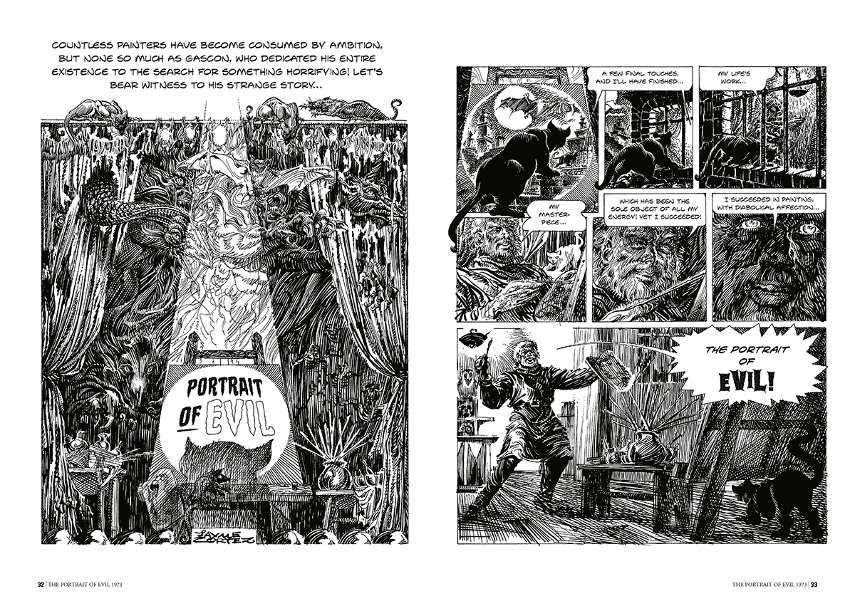
In 1963, Cortez released one of his most acclaimed works, The Portrait of Evil. It is a lean three-page comic that warns of a life of vice through the tale of an artist so desperate to commit true evil to canvas that his demonic creation comes to life. Cortez, however, had unfinished business with this sinister fable. A decade later, he decided to rework, expand, and modernise the comic for a 1970s audience. While the original comic employed angular and thin pen strokes — or, in Cortez’s own words, ‘heavy, twisted, hazy, and imprecise’ — this new version featured free-flowing, decorative penwork. Each panel is sumptuously rendered with a richness of pattern, every bit as reminiscent of Aubrey Beardsley as Cortez’s contemporary Sergio Toppi. His restless creativity and desire to evolve are on clear display and, like his doomed protagonist, signal Cortez’s own lofty artistic ambitions.
O Terror Negro no. 62, 1955
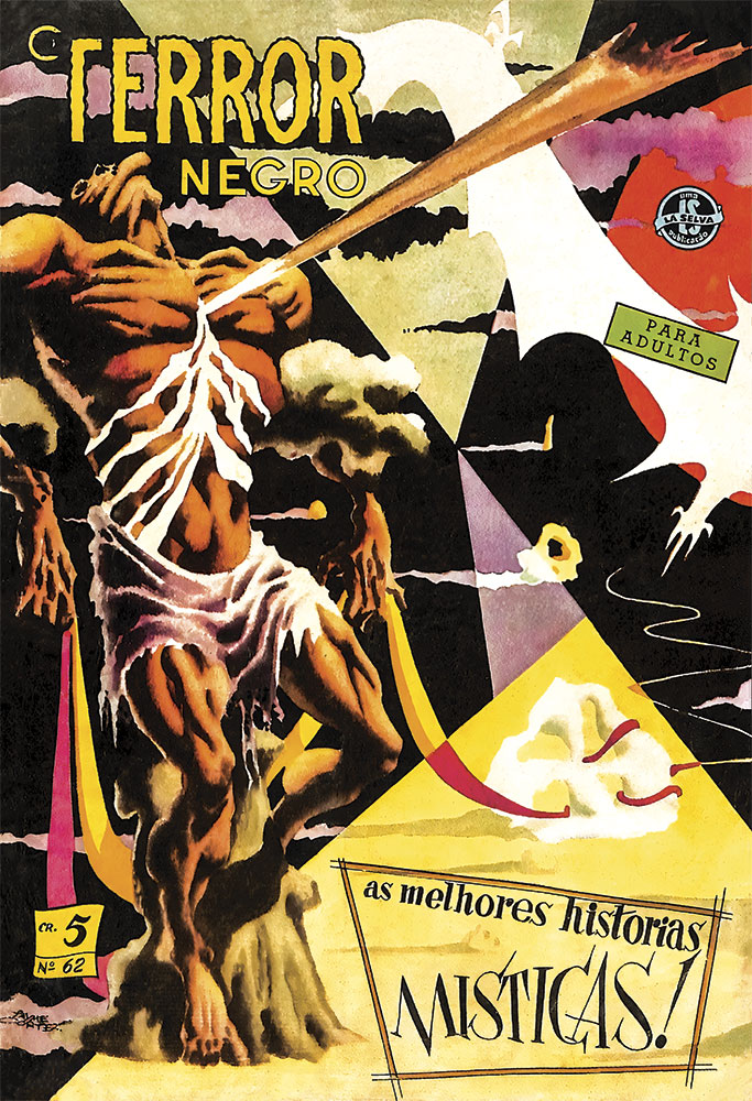
In just four years from his start at O Terror Negro, Cortez had taken his eerie eye for design into the realm of the surreal. In this cover, he seems to hark back to the past and peer into the future at once; the man in restraints has a Blakean physique, exaggerated by the harsh and solid black shadow, but is at odds with the shockingly modernist background. The page is segmented by bold, flat geometric shapes, which emphasise and play upon the very form of the comic medium. This is Cortez at his most unapologetic and uncompromising; it is an anachronistic image that is highly graphic yet still steeped in the illustrative tradition.
Seleções de Terror no.18, 1960
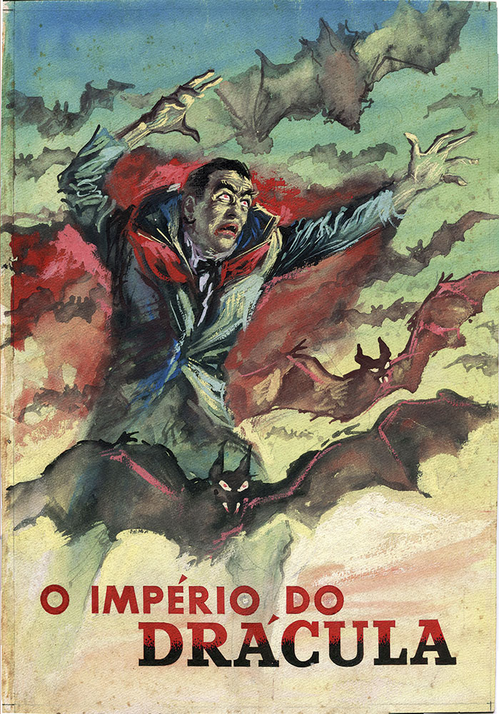
Cortez found himself the sole cover illustrator for a horror series yet again with Seleções de Terror, or in English, Terror Selection. Released by Continental, a publishing house in which Cortez was a partner, this cover forms part of a long run of pulpy Dracula titles. And for Dracula’s Empire, Cortez strips back his signature maximalist style for a striking illustration which prioritises colour above all else. This uncharacteristically simple composition, with its sans serif font, recalls the clear visual language of American World War Two propaganda posters whilst managing to retain a distinctly macabre essence. Aquamarine collides with vibrant bloody red while Dracula and his fleet of bats emerge as if from smoke, brought to life with rough, textural edges in watercolour.
Contos de Terror no.3, 1954
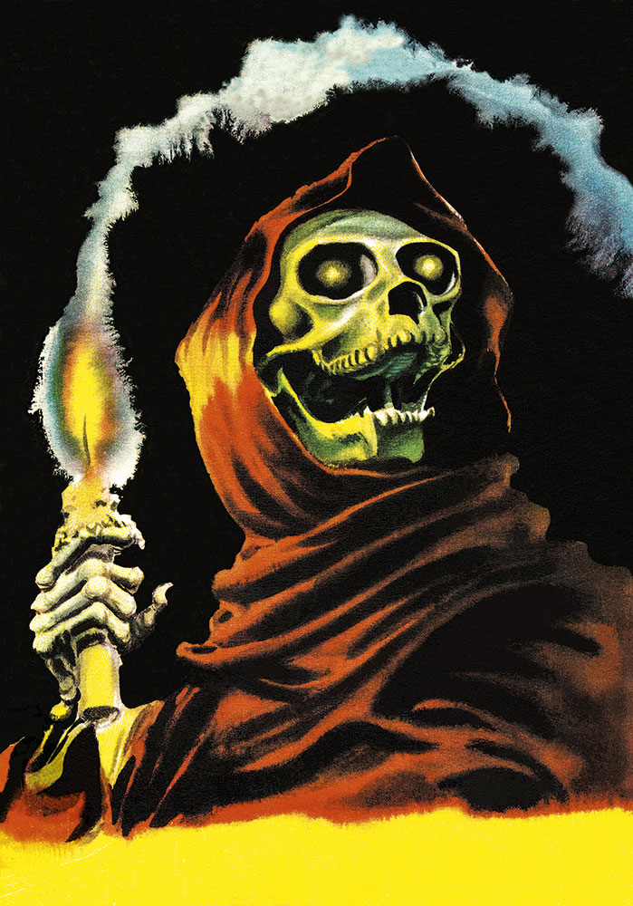
Working at the almost supernatural speed of one cover a day, Cortez’s output in the 1950s represented the artist’s endless imagination for fiendish foes. Amongst a cast of characters ranging from devils and spirits to zombies, this enigmatic skeletal figure is instantly iconic. It is an image grounded in a historic horror tradition, evoking the skull-like visage of The Crimson Ghost or perhaps calling to mind the red robe of Poe’s Mask of the Red Death. Despite these contextual roots, Cortez’s hooded ghoul seems to foreshadow a new kind of horror imagery. With its airbrush-style colouring (skillfully rendered in watercolour) and overt — almost camp - attempts to scare, Cortez’s skeleton speaks to a visual language which would dictate the horror aesthetic of everything to come, from album covers to board games.
With his remarkable skill and innovative vision, Jayme Cortez has left an indelible mark on the world of Brazilian horror comics. Explore more of his work by picking up a copy of Terror or Macabras, or collect both for a deeper dive into his work.