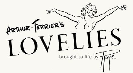
Rediscovering Arthur Ferrier: Pin-up Artist Extraordinaire
Posted by Emily Roach on 10th Jun 2024
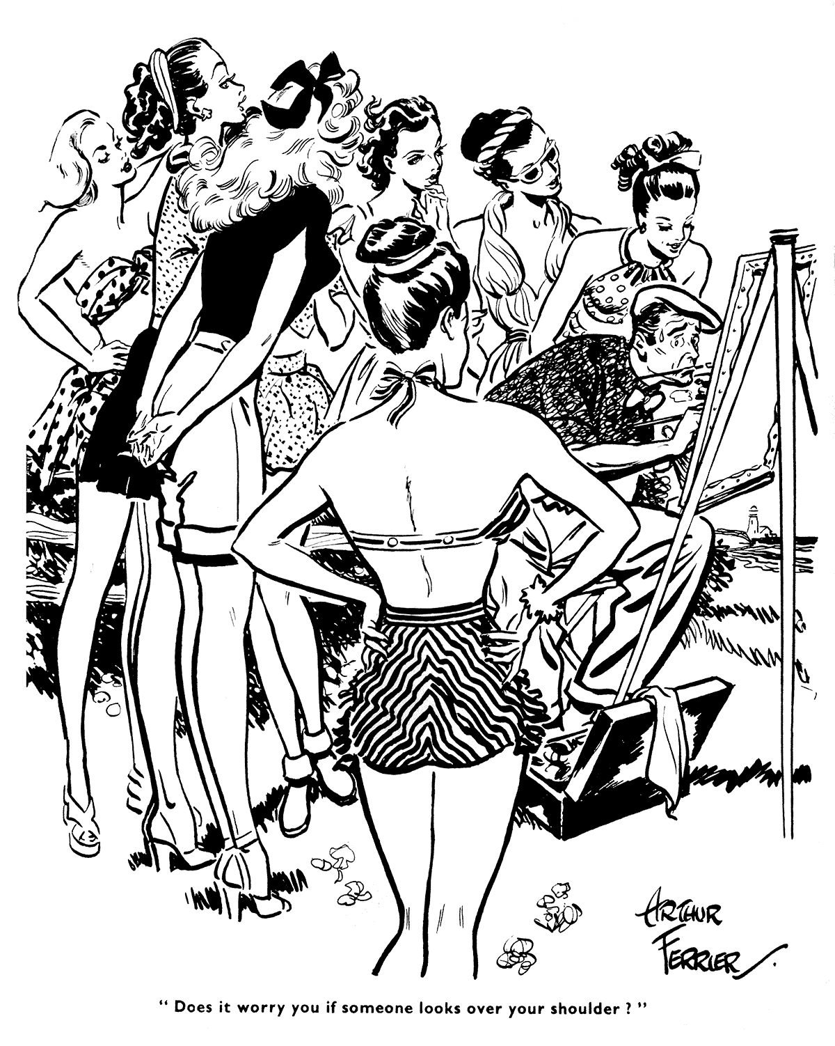
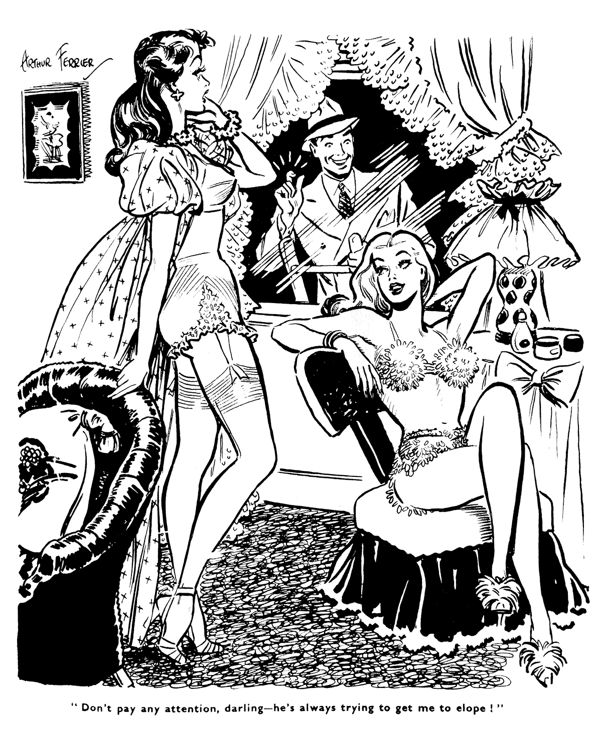
Arthur Ferrier is a true unsung hero of British illustration. Working across serialised comics, magazine covers, spot illustrations and portraiture, Ferrier was best known for his cheeky cartoons, which appeared in publications such as Blighty and the Sunday Pictorial.
I sat down with Rian Hughes, creator of the upcoming Pin-Up Parade anthology, to talk all things Ferrier.
Could you briefly introduce Arthur Ferrier (the man and artist) for those who have not heard of him?
Arthur Ferrier had a very long career – he was active from the thirties to the sixties. He first sold cartoons to the Daily Record while working as an analytical chemist in Glasgow. He later moved to London, where he got work from Punch, London Opinion, The Humorist and other weekly magazines. He drew one or two beautiful cartoons for Blighty magazine, a newsprint weekly, pretty much from its inception during World War Two through to its demise – it eventually changed its name to Parade and metamorphosed into a top-shelf magazine, by which time his work looked somewhat out of place.
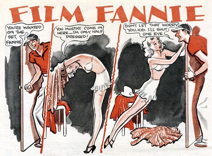
As well as his Blighty contributions, book illustrations and advertising work, Ferrier also drew comic strips – Film Fannie, Eve, ITMA (‘Its That Man Again’, based on a BBC radio comedy show) and Our Dumb Blonde, which ran in the Sunday Pictorial for seven years from 1939 to 1946.
When and how did you first discover Ferrier’s work?
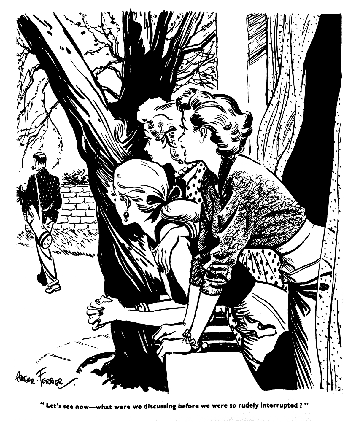
I’m a bit of a collector of old magazines, and I came across a few issues of Blighty on a market stall some twenty years ago and was astonished by his work. He has a natural facility with a brush, and having a keen eye for a curve, he accurately drew the fashions and styles of the period. He would always employ life models, male and female, which is why the outfits are so precisely evocative of the times.
What inspired you to create a book of his artwork? And why now, in 2024?
Some years ago, Image published a collection of my burlesque drawings from life in Soho Dives, Soho Divas. So, I already had an interest in the burlesque fashions of yesteryear, which feature heavily in Ferrier’s work. As I collected more and more of Ferrier's work and accrued a small number of his original drawings, it was a natural step to pitch the idea of a book to Korero Press, who seemed to be the natural home for such a project.
What is Arthur Ferrier’s artistic legacy?
Though very popular in his day, he’s pretty much overlooked now. I hope a book will bring his work to a new and appreciative audience. There has been a resurgence of interest in the history of illustration and the legacies of some very talented people whose work deserves to be reappraised and collected. In addition to being beautifully drawn, they serve as an interesting historical document of bygone attitudes and illustrate how far we’ve come. I’ve tried to put this into perspective in the book.
It’s interesting that you call it a 'historical document of bygone attitudes’ because, from a modern perspective, these early pinup illustrations sometimes straddle the line between cheeky fun and sexist rhetoric. How should we approach these works and values in 2024?
Some hoary old tropes do appear – the lecherous boss, the avaricious actress, sailors washed up on desert islands. You can see them in Punch, London Opinion, The Humorist and many other magazines from that period. In that regard, Ferrier was simply working through the cliches of the day and he is by no means the worst offender. As a cartoon historian said to me, ‘When we read works of art from the past we are not inviting them into our world, we are visiting theirs.’ We’ve definitely come a long way!
What do you think sets Ferrier apart from his contemporaries?
He was a superior draughtsman, and because he paid attention to the styles and fashions of the day, his work is rooted in a specific time and place. While other artists’ work was more cartoony or decorative, his was a style that owed more to the realistic magazine illustrators of the 1910s and 1920s. Charles Dana Gibson was a big influence.
What was the impact of Ferrier’s use of live models on his illustrative practice? Were there any regular models who not only left a significant mark on his work but became important figures in his life?
Ferrier always preferred drawing directly from life, sketching a basic layout to resolve the composition and posing his models as required. He’d dress his studio with the specific chairs, dressers, tables and other furniture needed to achieve the right period effect. This is one of the reasons his work serves as such an interesting record of the fads and fashions of the times — something he sought to achieve, reasoning that if an illustrator would do their research for a story set in a specific historical period, they should do their best to reflect their own time with the same attention to detail.
For other jobbing illustrators, this wasn’t always the case. Ferrier describes visiting an illustration agency where drawings would be assembled from an archive of clippings — a body from here, a head there. We’re lucky in that he went to the trouble of describing his working practice in detail, from the models he used– Anna Neagle, Lillian Bond, Miriam Jordan, Renee Gadd, Elsie Randolph and Dodo Watts–to the kinds of Gillott pen nib he preferred. Much of his practical advice still holds true today, and we have included it in the book.
Let’s talk about the logistics of making this book. Ferrier was incredibly prolific, yet his work is relatively obscure and, aside from the occasional sale at auction, hard to source. How did you go about putting together such a comprehensive collection of his artwork?
Occasionally hisoriginals turn upon eBay, but of course the vast majority probablyhaven’t survived. Those that I do have, or friends have, I’ve scanned for the book, so you can see all the paste-overs, white-out and pencil underdrawings. I find these details fascinating – it helps demystify the process and humanise the artist. Even Ferrier made mistakes and had to occasionally paste down a piece of paper and redraw a head or sleeve. These details, along with the insights they bring, are now lost with the perfection of digital.
The bulk of the images in the book are taken from printed scans, scanned at high DPI on a top-end Epson flatbed. Of course, the originals were printed on newsprint, so they have all the imperfections you’d imagine – over-inking, smudges, and foxed paper. I’ve done my best to clean these up. Others were shot with a camera from bound volumes in private collections or libraries – these sometimes had rolled page edges or were not shot completely square on, so they required more work. Some rarer items, like theatre programmes and scarves, were supplied by helpful fans who did their best with an iPhone – these we had to use small, so the lack of resolution wasn’t an issue. As a designer, you become adept at disguising the varied quality of the source material!
If his work is hard to source, information is doubly so. What challenges were you faced with when researching his life?
Digitised newspapers were a great help, as was the work of previous researcher’s, such as Paul Hudson’s A-Z of British Newspaper Strips. Paul kindly loaned some of his original clippings, which filled in some blanks–Ferrier’s ITMA strip for example, or perhaps his earliest strip,'The Twiddleknobs’, which I had been unaware of. Of course, there are undoubtedly many more stories and reminiscences out there to be retold, but I think we provide a good introduction to his work.
During the process of creating the book, were there any intriguing personal details or unique aspects of Ferrier’s artistic practice you discovered that were previously unknown to you?
He was an inveterate party-giver, and his bashes were attended by stars from the stage and screen, royalty, television personalities and politicians. He was very well-connected. As for his artistic practice, he was very generous in writing extensively about his methods, right down to the kinds of dip-pens he used. This is very much still relevant to illustrators and historians today, and we include some of this first-hand advice in all three books.
One final question: why should people buy the book? This is your opportunity to give us the hard sell!
It’s the first collection of his work, a long overdue tribute to one of the most celebrated and productive commercial artists of his time. For those who have a passion for fashion, pin-up, burlesque, or the history of cartooning and illustration, this book is a perfect fit. You'll be drawn in by his draughtsmanship and his detailed delineation of the fashionable female form.
Rian Hughes is a graphic designer, illustrator, comic artist, writer and typographer who has worked extensively for the British and American advertising, music and comic book industries. He has written and drawn comics for 2000AD, Vertigo CMYK and Batman: Black and White, and designed hundreds of logos for DC Comics, Marvel and other companies, including Batman, the X-Men, Superman, James Bond and The Avengers.
He has produced Hawaiian shirts, ranges for Swatch, record sleeves for Ultravox, and designed many typefaces, which are available through his foundry, Device Fonts.
His illustrations have appeared in magazines in the UK, US and Japan, and a retrospective monograph collecting his work, Art, Commercial, was published in 2001. He has recently published his first novel, XX, which he describes as a “novel, graphic”. Other publications include Lifestyle Illustration of the ’50s and Custom Lettering of the ’20s and ’30s, while his comic strips have been collected in Yesterday’s Tomorrows and Tales from Beyond Science, and his burlesque portraits in Soho Dives, Soho Divas. Logo-a-gogo (also from Korero Press) collects all his logo designs for the comic-book world and beyond.